

Typeface vs. Fonts: What is the Difference?

Before we delve into the best fonts for business cards, it’s essential to understand the difference between a typeface and a font. While these terms are often used interchangeably, they have distinct meanings.
What is a typeface?
A typeface refers to a specific style of lettering. It encompasses various design features, such as the presence or absence of serifs, the weight of the letters, the height, balance, and spacing. Typefaces are categorized into different forms, including serif, sans serif, script, decorative, Didone, and old styles. Serif and sans serif typefaces are the most commonly used for business cards.
What is a font?
On the other hand, a font is a variation of a typeface. It refers to a specific size, weight, and style within a typeface. For example, Arial is a typeface, and Arial Regular, Arial Bold, and Arial Italic are different fonts within that typeface. Fonts allow designers to create visual diversity within a typeface.
What is the Best Font for Business Cards?
The best font for your business cards depends on various factors, including the nature of your business, your brand’s tone and style, and your target audience. While there is no one-size-fits-all answer, we have curated a list of 15 best fonts for business cards in 2023 that cover a range of styles and purposes.
Seven Factors to Consider When Choosing a Font for your Business Cards
When selecting a font for your business cards, there are several factors to consider to ensure the font aligns with your branding and communicates your message effectively. Here are seven crucial factors to keep in mind:
1. Your Branding
Your font choice should embody the character and spirit of your brand. It should align with your branding guidelines and evoke the desired emotions and associations. For example, if your brand is modern and minimalist, a clean and sleek font like Helvetica or Roboto may be suitable. On the other hand, if your brand is elegant and sophisticated, a serif font like Baskerville or Clarendon may be more fitting.
2. Legibility
Legibility is paramount when it comes to business card fonts. Your font should be easy to read and understand, even at small sizes. Avoid using overly decorative or elaborate fonts that sacrifice legibility. Fonts like Arial, Helvetica, and Times New Roman are popular choices due to their clarity and familiarity.
3. Avoid using similar fonts
To create visual diversity in your business card design, avoid using fonts that have similar characteristics or look too similar. Using multiple fonts with distinct differences adds visual interest and helps differentiate different sections of your business card.
4. Limit the total number of fonts
Using too many fonts can make your business card design appear cluttered and unprofessional. Stick to using 2-3 fonts maximum to maintain a cohesive and harmonious design. Instead of introducing new fonts, consider varying the font size, weight, or style within the same font family to create visual hierarchy and interest.
5. Use fonts with contrasting differences
When working with multiple fonts, choose fonts that have contrasting differences. For example, pairing a serif font with a sans serif font creates a visually appealing contrast. This contrast adds depth and visual harmony to your business card design.
6. Font with large Family
Fonts with large families, such as Helvetica and Garamond, offer a wide selection of styles and weights. This versatility allows you to play around with different variations and create visual interest within your design. Having access to various styles and weights of a font can enhance the overall aesthetic of your business card.
7. Work with fonts that are most appropriate for your target audience
Consider your target audience and their preferences when choosing a font. Serif fonts are generally considered more traditional and are suitable for longer copies, while sans serif fonts are modern and often preferred by younger audiences. Understanding your target audience and tailoring your font choice accordingly can help you create a more impactful business card design.
15 Best Fonts for Business Cards In 2023
Now that we’ve covered the key factors to consider when choosing a font for your business cards, let’s explore the 15 best fonts for business cards in 2023:
1. Arial:
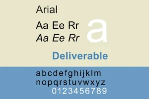
A simple and versatile sans serif font with a clean and legible look.
2. Times New Roman:
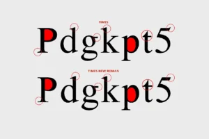
A classic serif font that exudes elegance and sophistication.
3. Helvetica:
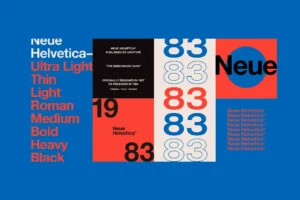
A widely-used sans serif font known for its clean and modern aesthetic.
4. Futura:

A geometric sans serif font that offers a sleek and contemporary look.
5. Riviera:
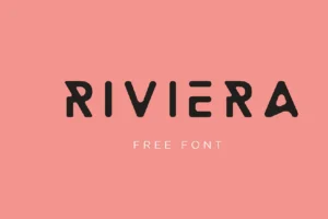
A script font that adds a touch of creativity and elegance to your business cards.
6. Playfair Display:

A transitional serif font that combines tradition and modernity for a professional look.
7. Buenard:

A high-quality serif font that adds an elegant and consistent touch to your design.
8. Apple Garamond:
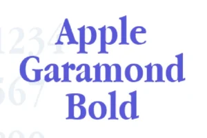
A serif font associated with Apple’s branding, perfect for a retro and authoritative feel (permission required for commercial use).
9. Montserrat:
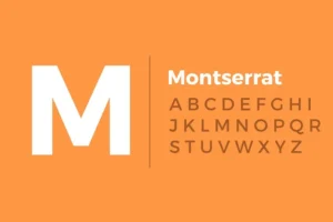
A geometric sans serif font that offers a clean and modern look suitable for various industries.
10. Roboto:
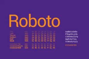
A versatile neo-grotesque sans serif font that is widely used in digital interfaces and offers a friendly and open feel.
11. Myriad Pro:

A sans serif font with a clean and airy look, ideal for professional business cards.
12. Clarendon:

A classic serif font with ornamental letters that adds a touch of grandeur and elegance to your design.
13. Rockwell:

A slab serif font that exudes confidence and power, perfect for impactful business card designs.
14. Riesling:

A script font with a unique and catchy texture, ideal for adding a personal touch to your business cards.
15. Baskerville:
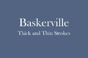
A timeless serif font with modern features, perfect for businesses with traditional values and a touch of elegance.
Choosing the Best Font for your Business Cards
Selecting the best font for your business cards requires careful consideration of your brand, target audience, and the message you want to convey. By considering factors such as branding, legibility, visual diversity, and audience appropriateness, you can find a font that aligns with your business and creates a lasting impression on your recipients.
Remember, the font is just one element of a successful business card design. It’s essential to create a cohesive and visually appealing layout that showcases your brand effectively. If you need assistance with designing your business cards, reach out to PixelFusion, the best logo-designing company in Hyderabad, known for their expertise in graphic design and print media design.
Now that you have a comprehensive list of the 15 best fonts for business cards in 2023, it’s time to unleash your creativity and design business cards that make a lasting impression on your clients and partners.